Start with atmosphere, not a paint chip
White walls are one way to make a room feel light, but they are not the only route to a Swedish-inspired interior. Color can bring warmth and character while preserving the easygoing quality many people appreciate in Swedish design. The useful question is not “What color should every wall be?” but “How should this room feel at different times of day?” A restful bedroom, a lively kitchen and a reading corner may each call for a different answer.
Sweden Culture Guide is an independent magazine about culture and everyday life, not a consulate or government service. Here, “Swedish-inspired” is a starting point for exploring a design approach, not a rulebook. Look at the light your room actually receives, the materials already in it and the colors you enjoy living with. A palette succeeds when it works in your home, rather than resembling a particular photograph.
Build a foundation with warm neutrals
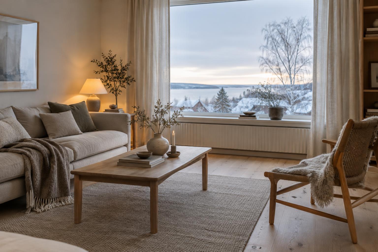
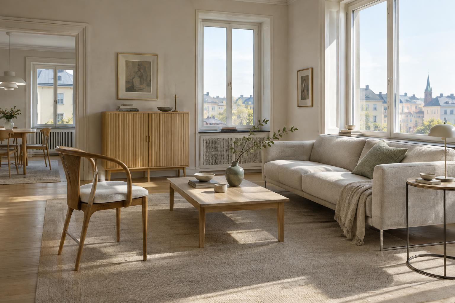
If brilliant white feels stark, try a neutral with a gentle undertone: oatmeal, chalky beige, pale mushroom or a soft gray warmed by brown. These shades can make a useful backdrop for wood, ceramics and textiles without demanding attention. They also give stronger accent colors somewhere to rest. Consider the room’s fixed elements first. A cream wall may flatter honey-toned floorboards, while a cooler stone floor might sit more comfortably beside a muted gray-beige.
You do not have to paint every surface the same color. A deeper neutral on lower cabinets, a door or a bookcase can give a pale room definition. Conversely, if the walls already have color, keep large pieces of furniture relatively quiet. Aim for a small family of related tones rather than trying to make every cream, brown and gray match exactly. Slight variation often makes a space feel more natural.
Choose colors with a connection to nature
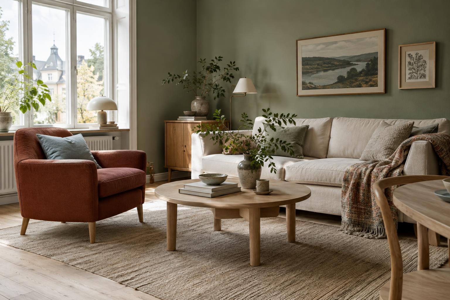
Muted greens, blue-grays, clay reds and ochre tones offer more possibilities than white alone. They can recall leaves, water, painted wood or earth without turning a room into a literal landscape. For a calm scheme, pair one of these colors with a warm neutral and repeat it in a few places: a cabinet front, a cushion and a piece of artwork, for example. Repetition helps the palette feel intentional even when the objects were collected at different times.
Think about intensity as much as hue. A dusty blue can feel gentle across a whole wall, while a clear, vivid blue may work better on a chair or lamp. Earthy red might make an inviting statement on a small piece of furniture, but feel heavy if it covers every surface in a dim room. If you love a bold color, start with a movable item or a painted sample board. You can then see how it behaves beside the rest of your furnishings.
Let materials and texture do some of the work
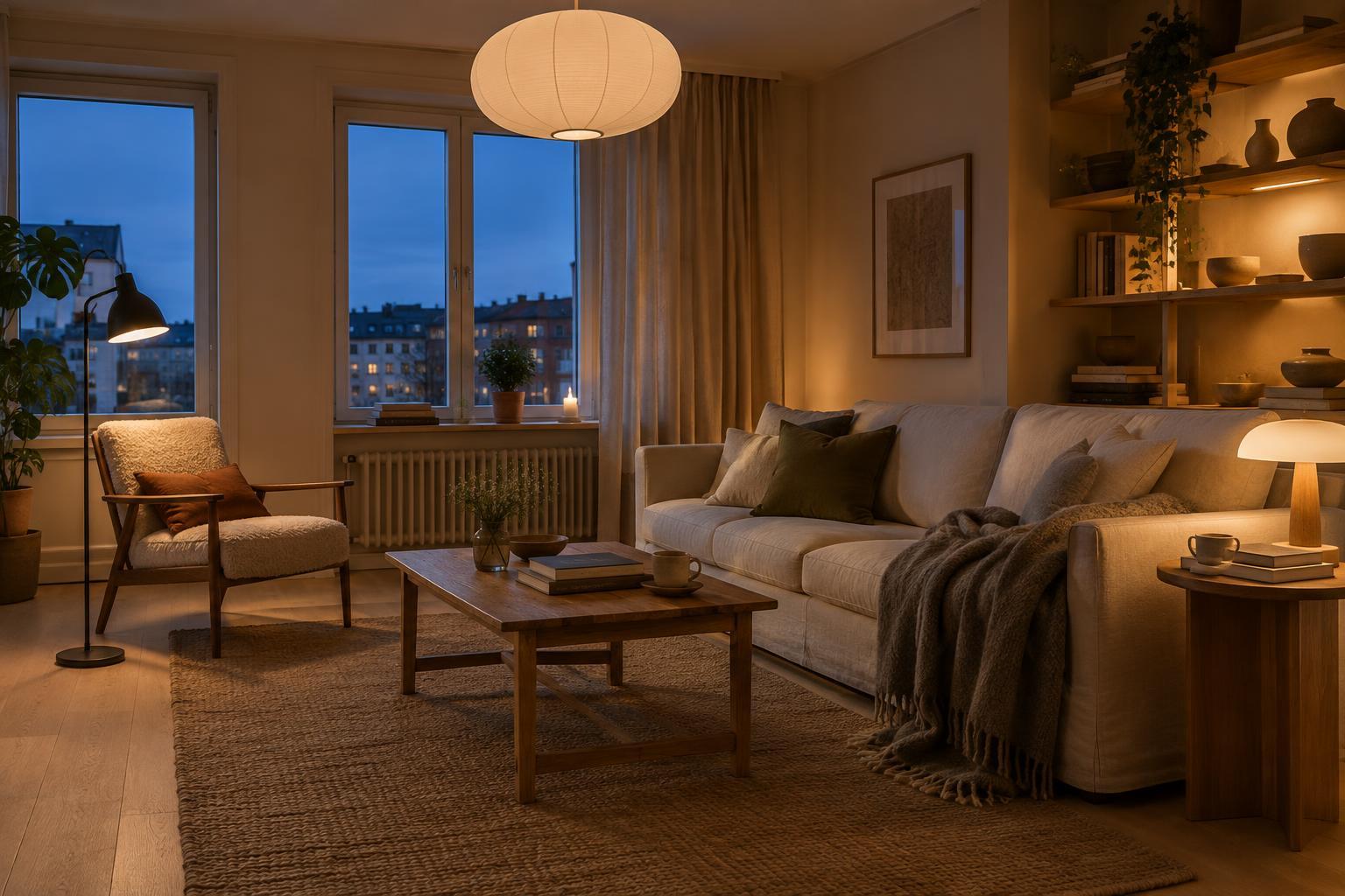
A color palette is not limited to paint. Pale wood, darker stained timber, woven textiles, glazed ceramics and brushed metal all contribute color. A room with neutral walls can feel rich when it includes the tan of a wooden table, the soft green of a linen curtain and the deep brown of a well-used leather chair. These materials also add texture, so the room need not rely on sharp color contrast for interest.
Try grouping samples before buying anything large. Place a fabric swatch beside a wood finish and a paint sample, then view them in the room in morning and evening light. Notice whether the undertones seem comfortable together and whether one element unexpectedly dominates. If the combination feels busy, remove a color before adding another. A restrained palette leaves room for books, flowers and everyday objects to change the scene over time.
Use contrast where it helps the room
Lightness feels more deliberate when there is something to set it against. A dark green cupboard can anchor a kitchen with pale walls. A rust-colored throw can warm a blue-gray sofa. Even small touches—a black lamp, a deep brown picture frame or a patterned rug—can give the eye a place to pause. The goal is not perfect symmetry; it is enough contrast to make the space feel clear and comfortable.
For an easy first step, choose one room and limit yourself to a foundation neutral, one main color and one smaller accent. Work with what you already own before repainting or replacing furniture. Change a textile, move a lamp or display ceramics in a new grouping, then live with the result for a while. Swedish-inspired color is less about following a fixed formula than about making considered choices that suit the light, materials and daily rhythms of your home.